Colour Theory in Interior Decorating
Colour sets the mood, creates flow, and even affects how we feel. Ever notice how some rooms feel instantly relaxing while others energize you? That’s colour theory at work.
Whether you’re designing a cozy retreat, a lively entertainment space, or a minimalist sanctuary, understanding how colours interact can help you create a space that looks great and feels even better.

Why Colour Theory Matters
Colour theory provides a roadmap for choosing and combining colours in ways that are both visually appealing and functional. Knowing how colours work together allows decorators to:
- Create balance and flow – A cohesive palette ties rooms together, preventing jarring transitions.
- Evoke emotions – Colours have a psychological impact: warm tones like red and yellow feel energizing, while cool tones like blue and green create a sense of calm.
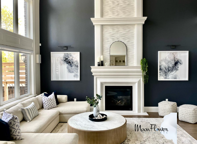
- Change how we perceive space – Lighter colours open up a room, making it feel airy and spacious, while darker hues add coziness and depth.
To keep a home feeling cohesive, use a dominant colour in one room as an accent in another—it’s a simple trick that works every time.
The Colour Wheel: Choosing the Right Palette
The colour wheel is your best friend when it comes to designing a well-balanced space.
- Primary Colours – Red, blue, and yellow. These are the building blocks of every other colour.
- Secondary Colours – Orange, green, and purple. Created by mixing primary colours, these add variety and personality.
- Tertiary Colours – A mix of primary and secondary, offering even more depth (e.g., blue-green, red-violet).
Popular colour schemes include:
- Analogous – Colours next to each other on the wheel (e.g., blue, teal, green) create a seamless, harmonious look.
- Monochromatic – Different shades of the same colour (e.g., light, medium, and dark blue) for a sophisticated, cohesive feel.
- Complementary – Opposites on the colour wheel (e.g., blue and orange, red and green) create bold contrast and visual interest.
If you’re nervous about colour, start with a neutral base (white, beige, or gray) and introduce colour through accents like pillows, rugs, or wall art. It’s an easy way to test the waters.

How Lighting, Texture & Location Affect Colour
Factors like lighting, texture, and geography all influence how colour is perceived.
- Natural Light – Light changes throughout the day, affecting how colours appear. South-facing rooms get warmer light, while north-facing rooms tend to make colours look cooler. Always test swatches in the actual space before committing.
- Accent Lighting – Task lighting, ambient lighting, and decorative lighting all impact how colour reads. A well-lit space can make colours pop, while dim lighting can mute them.
- Texture Matters – Matte surfaces absorb light and appear softer, while glossy finishes reflect light, making colours feel more vibrant. A dark wood floor absorbs colour differently than a high-gloss countertop.
- Geography Plays a Role – A colour that looks rich and saturated in a Mediterranean home might appear washed out in a colder, northern climate.
Before painting a room or buying furniture, test samples at different times of day—morning, noon, and evening. You might be surprised at how much colour shifts!

The Psychology of Colour: How Colour Impacts Mood
Colour affects how we feel and behave in a space.
- Warm Colours (red, orange, yellow) – Inviting, energetic, and bold. Great for social spaces like living rooms and dining areas.
- Cool Colours (blue, green, purple) – Calming and serene. Perfect for bedrooms, bathrooms, and offices where relaxation or focus is key.
- Neutrals (gray, beige, white, brown) – Timeless and versatile. Neutrals make an excellent backdrop for bolder accents.
- Bright Colours – Add energy and playfulness but can be overwhelming in large doses.
- Dark Colours – Create intimacy and drama but can make small spaces feel even smaller if overused.
Want to boost focus in a home office? Try deep blues or greens. Looking to create a cozy bedroom? Soft neutrals or warm hues are the way to go.

Colour is one of the most powerful tools in decorating. It can make a space feel larger, cozier, more luxurious, or more fun—all depending on how you use it. Whether you’re making a bold statement or aiming for subtle elegance, colour theory gives you the confidence to choose shades that truly work.
So go ahead, experiment! Start with small pops of colour in accents, or go all in with a statement wall. Either way, when you apply colour theory with purpose, you’ll create spaces that not only look stunning but feel just right.

")