Unforgettable Events? It’s All in the Colour
Over the past few weeks, we’ve explored the key elements of event design—space and layout, line and form, and lighting. Now, it’s time to talk about one of the most powerful tools in your event design toolkit: colour.
Colour sets the mood, shapes the energy, and influences how guests experience an event. The right palette can excite, calm, or inspire, and when used strategically, it can even guide movement and interaction.
At the end of the day, guests may not remember the exact shade of blue you used, but they’ll remember how the space made them feel—and that’s the power of colour.
The Psychology of Colour in Events
Colour affects mood, behavior, and perception—which is why picking the right palette is more than just an aesthetic choice.
- Bold, warm tones (reds, oranges, yellows) bring excitement and energy—great for lively parties and celebrations.
- Cool shades (blues, greens, purples) create a sense of calm and focus—ideal for corporate events or formal gatherings.
- Neutrals and soft pastels evoke elegance and subtlety, perfect for weddings and upscale events.
Colour choices should align with the event’s purpose. A high-energy product launch? Go bold. A meditation retreat? Stick to soothing hues.
Cultural Considerations
Colour holds different meanings across cultures, so it’s important to be intentional—especially for international events, multicultural weddings, and corporate gatherings.
However, not everyone within a culture will personally associate with these meanings, as traditions and interpretations can vary. When in doubt, it’s always best to ask or consider the preferences of your audience.
Red
In China, India, and other Asian cultures, red symbolizes luck, prosperity, and celebration, making it a popular choice for weddings and New Year festivities. In Western cultures, red is associated with love, passion, or urgency—but it can also signify danger or caution.
White
In North America and Europe, white is a symbol of purity and weddings, but in China, India, and some other Asian cultures, it represents mourning and funerals. Context matters—consider how it’s perceived within the specific event.
Green
Often linked to nature, renewal, and fertility, green is a symbol of good luck and prosperity in many cultures. However, in some Latin American countries, green has been associated with death or envy.
Yellow
In Western cultures, yellow is associated with happiness, warmth, and optimism.
Blue
Seen as a calming and trustworthy colour in Western and corporate settings, blue is also deeply spiritual in many cultures. In Middle Eastern countries, blue is believed to ward off the “evil eye” and bring protection.
Black
In Western cultures, black is often associated with elegance, formality, and sophistication, but it is also the primary colour of mourning and grief. In some African and Asian cultures, black is traditionally worn at funerals but can also symbolize mystery and power.
Purple
A colour long associated with royalty and wealth, purple was historically reserved for nobility in ancient Rome, Egypt, and Japan. However, in Brazil and Thailand, purple is linked to mourning and widowhood.
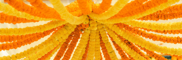
Orange
In Hinduism and Buddhism, orange (or saffron) is a sacred colour representing spirituality and enlightenment. In Western cultures, orange is often associated with energy and warmth, while in the Netherlands, it symbolizes royalty due to the Dutch royal family’s House of Orange.
If you’re designing an event for a multicultural audience, consider researching colour associations to ensure your choices are meaningful and well-received.
Colour meanings are not one-size-fits-all, and personal or regional variations exist. When planning weddings or high-profile events, asking about personal preferences can go a long way in making guests feel included and respected.
Designing a Thoughtful Colour Palette
A cohesive colour scheme should complement the event’s objective, time of day, and venue.
Consider the Venue – Some venues have dominant colours (carpeting, walls, furniture) that you’ll need to either work with or contrast.
Factor in Lighting – Ever bought something that looked one colour in the store and totally different at home? The same thing happens with event lighting. Test your colours under the venue’s lighting before making final decisions.
Create a Mood Board – Gathering colours, textures, and materials in one place ensures everything looks cohesive before committing to final choices.
Avoid relying on one colour. Layer shades and tones to create depth and dimension. A monochrome palette with varying intensities can feel just as dynamic as a bold contrast.
Using Colour to Guide Guest Experience
Beyond aesthetics, colour can be a strategic tool for directing attention and enhancing guest flow throughout an event.
- Wayfinding & Signage – Colour-coded elements can subtly guide guests to different sections (e.g., warm tones for cocktail areas, cooler tones for networking spaces).
- Highlighting Key Features – A pop of colour can draw attention to focal points like the head table, dance floor, or buffet.
- Encouraging Interaction – If an event includes networking or breakout areas, different colours can help guests naturally gravitate toward specific zones.
- Creating Separation Without Barriers – Instead of physical dividers, using contrasting colours in different areas can define spaces without disrupting visual flow.
Colour Transitions Throughout an Event
Events aren’t static, and neither should your colour scheme be. Thoughtfully shifting colour throughout different phases of an event can subtly influence guest experiences.
Arrival & Cocktail Hour – Softer, welcoming tones help guests ease into the event. Consider warm neutrals, pastels, or soft washes of colour through ambient lighting.
Main Event (Dinner, Presentation, Key Moments) – This is where bold colours or dramatic lighting can take center stage. Deep, rich tones or contrasting accents can elevate the atmosphere.
Late-Night & Party Atmosphere – A shift to deeper, moodier colours or dynamic lighting (think purples, reds, or neon effects) signals a transition into a more lively, high-energy space.
Colour transitions can be achieved through lighting shifts, décor changes, or even guest experiences—like introducing vibrant signature cocktails as the evening progresses.
Where Colour Comes to Life
Rather than limiting colour to just one or two big elements, layer it throughout the event for a cohesive, immersive experience.
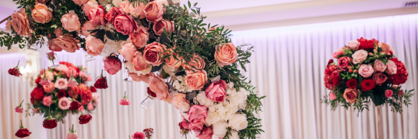
Décor & Drapery – Table linens, chair covers, backdrops, and ceiling installations can bring colour into the space in subtle or dramatic ways. Layering different shades of the same colour creates depth.
Lighting – Uplighting, LED accents, candles, and projection mapping can shift the mood entirely. Warm amber hues create intimacy, while cool blues add sophistication. Dynamic lighting transitions can change the event atmosphere as the night progresses.
Printed Materials – Menus, place cards, programs, and signage should reflect the overall colour palette for a polished, put-together feel. Even small details—like the wax seal on an invitation or the ribbon on a napkin—help tie everything together.
Food & Beverages – Colourful cocktails, desserts, or garnishes can reinforce an event’s theme. A monochrome dessert table or signature drink in your event’s key colours can be both functional and visually stunning.
Bringing It All Together
Colour isn’t just about making things look good—it’s about making people feel something. The right palette can spark excitement, create intimacy, or set the tone for an unforgettable experience.
By layering colour through décor, lighting, signage, and even food and drinks, you create more than just a visually appealing event—you create a fully immersive atmosphere. And when done well, guests may not remember the exact shades you used, but they’ll remember how the space made them feel.
Next week, we’ll dive into texture—because if colour sets the mood, texture brings it to life. Stay tuned!