Mastering the Art of Colour:
Focusing on Mood and Lighting

Selecting the perfect paint colour for a client’s space isn’t just about picking a pretty shade—it’s about creating the right mood, complementing the design elements, and ensuring a cohesive look.
Whether you’re a seasoned decorator or just starting out, confidently guiding clients through the colour selection process can elevate your services and set you apart. In this blog, we’ll take a deeper dive into two of the most crucial factors: understanding the space’s purpose and mood, and considering natural and artificial lighting.
Understanding the Space’s Purpose & Mood
Every room serves a different function, and colour plays a crucial role in defining the atmosphere. The right colour choice can transform a space into a peaceful retreat, a warm and inviting area, or an energising workspace. When consulting with clients, ask how they want to feel in the space. Their answers will help guide the colour selection process.
- Calm & Relaxed – Soft blues and greens, such as Benjamin Moore’s Palladian Blue (HC-144) or October Mist (1495), create a serene, spa-like atmosphere. These shades work beautifully in bedrooms and bathrooms, where a sense of tranquillity is desired.
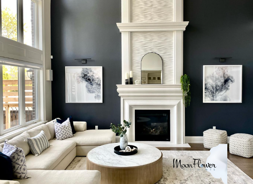
- Warm & Cozy – Earthy tones like Shaker Beige (HC-45) or Lenox Tan (HC-44) provide a comforting and inviting feel, making them ideal for living rooms and dens. These colours pair well with natural textures like wood and stone.
- Energised & Productive – Brighter hues, such as Hawthorne Yellow (HC-4) or crisp whites like Chantilly Lace (OC-65), bring vitality to offices and kitchens. Yellows encourage creativity and focus, while clean whites create a fresh, airy space that enhances productivity.
To reinforce these colour choices, consider the psychological impact of colours. Blues and greens are known for their calming effects, while reds and yellows promote energy and excitement. Neutral tones, on the other hand, offer flexibility and can be layered with bold accents to suit different moods over time.

Considering Natural & Artificial Lighting
Lighting is one of the most overlooked factors in paint selection, yet it has the power to dramatically alter how a colour appears. A paint swatch may look perfect under store lighting but completely different when applied to a client’s wall. That’s why it’s essential to evaluate how light interacts with colour before making a final decision.
- Rooms with abundant natural light – Spaces that receive plenty of daylight can handle darker hues without feeling closed in. North-facing rooms tend to bring out cooler undertones, while south-facing rooms enhance warmth in colours.
- Spaces with minimal light – Rooms with little natural light benefit from lighter, warm-toned shades to prevent them from feeling too cold or dull. Soft neutrals and warm whites help reflect available light and make the space feel brighter.
- Artificial lighting impact – Different types of artificial light can significantly influence how a paint colour looks:
- LED lighting – Available in warm and cool tones, LEDs can either enhance warmth or create a stark, modern effect.
- Warm white bulbs – These lights add a cosy glow, making warm colours appear even richer while muting cooler hues.
- Daylight bulbs – Mimicking natural light, these bulbs bring out the truest version of a colour but can make some shades feel too crisp or sterile.
- LED lighting – Available in warm and cool tones, LEDs can either enhance warmth or create a stark, modern effect.
To ensure accuracy, always test samples under the room’s actual lighting conditions. Applying paint swatches on different walls and observing them at various times of the day can prevent surprises once the entire space is painted.
Final Thoughts
Mood and lighting are two of the most critical aspects of selecting the perfect paint colour. By understanding how a client wants to feel in their space and how lighting interacts with colour, decorators can make informed recommendations that enhance the overall design. Benjamin Moore’s extensive colour collection offers endless possibilities, allowing you to find the ideal shade for any project.
Remember, taking the time to evaluate mood and lighting will ensure a stunning and cohesive result—one that your clients will love for years to come!
FAQs About Mood and Lighting
Natural light can dramatically change how a colour is perceived. In a room with strong, direct sunlight, a colour might appear more vibrant and saturated, whereas softer, diffused light can mellow the hue.
The angle of the sunlight and the time of day also play significant roles—morning light can lend a warm glow, while afternoon light might cool the tone slightly. Observing your space under various natural lighting conditions helps you understand the true character of the colour.
Start by evaluating the room’s natural light sources. Note the window orientation and size, as well as any architectural features that might influence how light enters the space.
Pay attention to how the light shifts throughout the day—identify which areas receive the most sunlight and where shadows fall. This comprehensive view will help you predict how your chosen colour might look at different times, ensuring a more harmonious result.
Different artificial light sources can alter the appearance of a colour in subtle yet important ways. For example, LED lights often come with adjustable settings that can either enhance warm undertones or cool them down, depending on the chosen temperature.
Warm white bulbs generally cast a cosy, inviting glow that can enrich earthy or neutral colours, while daylight bulbs mimic natural light, offering a more balanced and true-to-life depiction. Understanding these variations helps you select a colour that remains appealing under various lighting conditions.
A practical strategy is to apply small paint samples on multiple walls where lighting conditions differ. Observe these samples at different times of the day—morning, afternoon, and evening—to see how they change with varying natural and artificial light.
This hands-on approach ensures that you capture the full range of how the colour behaves in your specific space, reducing the risk of unexpected surprises once the room is fully painted.
In rooms with limited natural light, opting for lighter, warm-toned colours can help brighten the space and create a welcoming atmosphere. Lighter hues reflect more of the available light, making the area appear larger and more open, while warm tones add a touch of coziness.
Additionally, consider enhancing the space with layered artificial lighting—such as ambient, task, and accent lighting—to further elevate the overall brightness and balance of the room.


")